


Focusing on innovation, we used generative AI to help users bring their imagination to life and find musical matches effortlessly
See my work


This project had a significant impact on stakeholders and leadership, as they were impressed by the solutions I proposed. My recommendations were well-received, leading to an immediate agreement to implement them in the next quarter.
The platform is a comprehensive tool for finding doctors, care facilities, and related services.
However, the Locations landing page lacks distinction from the Find a Doctor page, failing to provide location-specific context or actionable information.
This results in a generic user experience that does not cater to users' unique needs or support seamless navigation.
Increase Digital Appointment Bookings
Drive Traffic to Local Ministry Pages
Increase User Engagement

During my internship, I identified key areas for improvement for the company's platform and successfully proposed enhancements that were adopted by the team.
Contributing to a live platform allowed me to apply my problem-solving skills in a real-world setting.
This experience highlights my ability to collaborate effectively, address user experience challenges, and deliver impactful solutions that improve operational efficiency and user engagement.
A leading faith-based healthcare organization is dedicated to providing compassionate, personalized care nationwide.
Its public-facing platform serves as a primary gateway for users to search for doctors, explore nearby locations, and book appointments, creating a critical touchpoint for building strong relationships with patients.
40% rise
in micro-influencers joining the platform within the initial three months.
25% increase
in successful brand-influencer collaborations within six months post-landing page launch.
Team
Shivani Mehta
Digital Product Design Intern
Mary Fedorowski
Director of Experience Research & Design
Devin Manternach
Digital Product Design Lead
Tools Used


Prototype Link

Limited understanding of the sales industry
Creating this app was a challenge due to my limited understanding of the intricacies of the sales industry and loan management.
Time management for interviews and testing
The users' full-time commitments at the showroom made it challenging to schedule tests and interviews without disrupting their daily operations.
Challenging age group targeting
Inquiring about people's age felt uncomfortable, and the showrooms predominantly catered to a younger demographic.
The primary goal was to bridge the gap between B2B and B2C operations, creating a seamless and transparent process while ensuring secure payments.
To achieve this, it was necessary to deep dive into the user pain points and goals and break them down into smaller, actionable objectives through user interviews.

How do you manage and track car sales leads at present?
How do you maintain communication and follow up with potential customers effectively in your experience?
How do you manage and organize customer information and data in your approach?
How valuable would it be for you to have an app that integrates smoothly with your current sales tools and systems?
Have you used any sales management apps before? If yes, what did you like or find challenging about them?
What additional features or functionalities could enhance your ability to manage car sales efficiently?
Expressed frustration
in managing loan-related tasks due to the inefficiency of juggling multiple tools and systems.
Expressed desire for learning
by gaining access to essential tools and resources in handling challenges during car sales.
Prioritized goal-setting feature
enabling them to define and track their sales targets seamlessly for improved performance in car sales.

I love helping customers find their dream cars, but the paperwork can be overwhelming. I need a solution that simplifies the administrative tasks and keeps me informed about the latest models and pricing.
Fierce Competition
Faces pressure to meet sales targets in a competitive market.
Tedious paper-work
Struggles with tedious and time-consuming paperwork.
Lack of resources
Encounters challenges in finding efficient tools and resources to support sales efforts.
Goal-setting feature
Increase car sales and commissions by setting sales targets.
Access to resources
Seek tools and resources that can make his sales process more efficient.
Serve customers
Access to detailed car information, pricing, and features to answer customer inquiries.
As a Gen Z Micro Influencer, I strive to connect with relevant brands directly, without any middlemen, and have greater control over brand collaborations. My primary goal is to increase my visibility and gain access to exclusive deals and promotions that align with my values and interests. Therefore, I am looking for a user-friendly platform that offers a seamless experience, making it easy for me to understand and navigate.
Obstacles due to middlemen and irrelevant brand collaborations
Lack of visibility and recognition as a micro influencer
Difficulty in understanding and navigating complex technology and features
Increase visibility & connect with relevant brands directly
Increase visibility & connect with relevant brands directly
Increase visibility & connect with relevant brands directly


Empowering users with the ability to select their preferred language enhances their comfort and ease of navigation within the app. It broadens the app's accessibility.
Gamification adds an element of fun and competition to apps, boosting user engagement and motivation. It encourages users to achieve goals, and interact enjoyably with the app
Color coding and labels in interface design streamline user interaction by providing visual cues and clear descriptions, improving usability and user understanding.
Onboarding screens are introductory screens that guide users through its features and functionalities, helping them become familiar with the app's interface and purpose.

.png)


1. We engaged the same 5 participants from the UX research for usability testing, ensuring alignment with our target user group.
2. The usability testing took the form of moderated sessions, in the user's showrooms at their convenience.
3. Participants were assigned 6 tasks mentioned below, and I observed and recorded their actions and behaviors while maintaining periodic communication with them throughout the process.
Onboarding process
Explore the onboarding screens and register as a new user.
Navigate to Learning resources
Check out the "Learning Resources" available in the app.
Add a new customer
Go ahead and try to add a new customer.
*Customer details were provided in the task sheet*
Check loan eligibility
After adding the customer, check if the customer is eligible for a loan.
Add a new follow-up
Add a follow-up for the new customer for their new car.
*Car details were provided in the task sheet*
Update follow-up status
Go to your follow-ups and update the status the recent follow-up to "Mark as done".

Faced language barrier
During the onboarding process, users encountered language barriers that hindered their ability to register on the app.
Found it difficult to navigate
Users couldn't find the "Learning Resources" option easily. It wasn't discoverable
Unable to save and navigate
Users were frustrated with the missing "save details" option and unclear navigation while adding a new customer, leading to process disruption.
Information & flow mismatch
Found information and flow mismatch while checking loan eligibility of a customer
Missing 'Add Follow-up' in 'Follow-up' Tab
Users experienced difficulty locating the "Add Follow-up" option within the "Follow-up" tab, leading to confusion and hindered task completion.
Unaware of swipe gestures
Didn't know about the swipe gesture to update the status of the follow-up. Feature didn't work well with the users


-min.gif)


Customer satisfaction
After conducting usability tests, the app's design led to an enhanced customer experience. Customers were able to navigate the options seamlessly, resulting in heightened satisfaction and positive interactions.
Acquired Insight into the Sales Process
During the design process, I gained valuable knowledge about the intricacies of the sales process, enabling me to create a more intuitive and effective sales-oriented application.
Focused on Accessibility
Emphasizing accessibility through design choices tailored for users aged 40-50, the app prioritized legibility and ease of use, promoting inclusivity and effortless navigation.
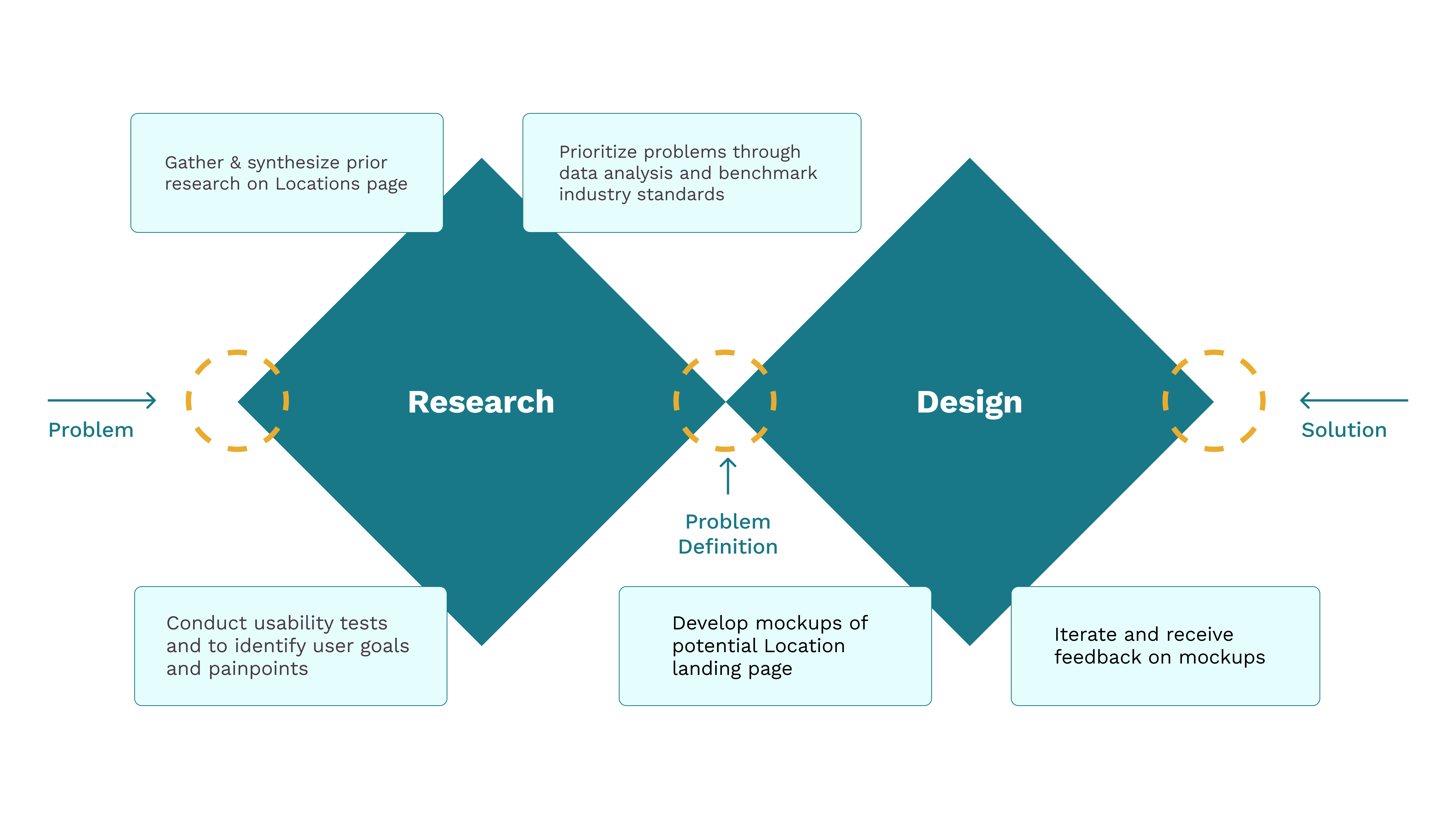
Analyzing historical research on user behavior and expectations to refine how location information is organized and presented.
Location Mental Models
Participants organize location information both geographically (e.g., by state) and by the facility type (Urgent Care, Hospital, etc.)
Browsing with Specificity
Users browse with specific intent: when clicking on the Locations page, they expect to see relevant location-specific information
Crawlability of Location Pages
Google is unaware of the importance of the location pages because we have little to no internal linking to our local pages

The "Location" labels in the Find Care search bar create ambiguity, as it's unclear if they refer to a care type (e.g., Primary Care) or a physical location (e.g., Austin, Texas).

The three primary location types displayed here don’t appear interactive or clickable
Multiple links with no proper structure for "More location types" create an overwhelming experience for the users
How might we design the Locations page to provide users with clear, actionable information, and support seamless access to local services, thereby improving engagement and user satisfaction?
Relevant and specific content on each page encourages quicker decision-making and smoother interactions.
Displaying a list of hospitals directly on the landing page adds context and enables users to take immediate action.
Organizing different categories with tabs allows users to easily switch between location types.
Using clearer terminology for facilities and locations enhances user understanding and better aligns with their needs.


Simplifying navigation with tabs for switching between primary facility types while showcasing nearby locations to enable quick user action.

Organizing facilities alphabetically enhances clarity and engagement.
Users may not recognize medical terms, and hiding them under tabs could hinder accessibility.
Lack of visual aids limits user understanding of facility terms.

Displays all facilities at once with icons while maintaining alphabetical categorization for easy browsing.
Descriptions for each facility can feel overwhelming.
Icons lack prominence, reducing their visual impact.

Facilities are categorized with prominently visible, visually engaging icons for consistency
Descriptions are revealed on hover for a cleaner, user-friendly experience.

Renamed the "Locations" label in the first tab to "Facilities" based on insights from competitive analysis and secondary research to enhance clarity and usability.
“I think the way you did it was more visually engaging and easy to navigate. I like how you categorize information, order them alphabetically, and have the icons and visual elements."
-Usability Testing Participant


Highlighting the company’s extensive market presence while driving traffic to local ministry pages for increased engagement and localized support.

Showcasing the company’s accreditations and recognitions to establish user trust while interlinking relevant pages to enhance navigation and drive engagement.
“I think your map view is very visually engaging and also helps break up the info and help find local areas easily."
– Usability Testing Participant
Digging through Previous Research
Digging through previous research was challenging due to the large volume of files and fragmented information, requiring constant communication to clarify findings and guide the project effectively.
But as they say, 'All's well that ends well,' and this project ultimately delivered great satisfaction.


