


Focusing on innovation, we used generative AI to help users bring their imagination to life and find musical matches effortlessly
See my work


Faster Upload Times
Increase in Seller Satisfaction
Reduction in Upload Errors
Kearlit is a comprehensive platform for the jewelry and stone trade, that aims to streamline online transactions.
The current process for uploading and managing product details is time-consuming and prone to errors, making it difficult for sellers to maintain accuracy and streamline their workflows.
This creates barriers to efficient inventory management and impacts overall sales performance.
Increase Seller Retention
Boost Product Uploads
Reduce Product Mismatch Errors

Early in my career as a Product Designer, I had the opportunity to collaborate with a jewelry business entrepreneur on designing an e-commerce web platform for their new venture, "Kearlit."
My primary responsibility was to develop a cohesive system that efficiently and securely managed transactions for B2B and B2C operations.
Kearlit is envisioned as a comprehensive platform designed to enable retailers, manufacturers, wholesalers, and individual customers to effortlessly buy and sell stones and jewelry online.
Beyond facilitating transactions, it offers tools for uploading and managing product stock, tracking orders, and providing advanced filtering and browsing capabilities for both sellers and buyers.
40% rise
in micro-influencers joining the platform within the initial three months.
25% increase
in successful brand-influencer collaborations within six months post-landing page launch.

Limited understanding of the sales industry
Creating this app was a challenge due to my limited understanding of the intricacies of the sales industry and loan management.
Time management for interviews and testing
The users' full-time commitments at the showroom made it challenging to schedule tests and interviews without disrupting their daily operations.
Challenging age group targeting
Inquiring about people's age felt uncomfortable, and the showrooms predominantly catered to a younger demographic.
The primary goal was to bridge the gap between B2B and B2C operations, creating a seamless and transparent process while ensuring secure payments.
To achieve this, it was necessary to deep dive into the user pain points and goals and break them down into smaller, actionable objectives through user interviews.

How do you manage and track car sales leads at present?
How do you maintain communication and follow up with potential customers effectively in your experience?
How do you manage and organize customer information and data in your approach?
How valuable would it be for you to have an app that integrates smoothly with your current sales tools and systems?
Have you used any sales management apps before? If yes, what did you like or find challenging about them?
What additional features or functionalities could enhance your ability to manage car sales efficiently?
Expressed frustration
in managing loan-related tasks due to the inefficiency of juggling multiple tools and systems.
Expressed desire for learning
by gaining access to essential tools and resources in handling challenges during car sales.
Prioritized goal-setting feature
enabling them to define and track their sales targets seamlessly for improved performance in car sales.

I love helping customers find their dream cars, but the paperwork can be overwhelming. I need a solution that simplifies the administrative tasks and keeps me informed about the latest models and pricing.
Fierce Competition
Faces pressure to meet sales targets in a competitive market.
Tedious paper-work
Struggles with tedious and time-consuming paperwork.
Lack of resources
Encounters challenges in finding efficient tools and resources to support sales efforts.
Goal-setting feature
Increase car sales and commissions by setting sales targets.
Access to resources
Seek tools and resources that can make his sales process more efficient.
Serve customers
Access to detailed car information, pricing, and features to answer customer inquiries.
As a Gen Z Micro Influencer, I strive to connect with relevant brands directly, without any middlemen, and have greater control over brand collaborations. My primary goal is to increase my visibility and gain access to exclusive deals and promotions that align with my values and interests. Therefore, I am looking for a user-friendly platform that offers a seamless experience, making it easy for me to understand and navigate.
Obstacles due to middlemen and irrelevant brand collaborations
Lack of visibility and recognition as a micro influencer
Difficulty in understanding and navigating complex technology and features
Increase visibility & connect with relevant brands directly
Increase visibility & connect with relevant brands directly
Increase visibility & connect with relevant brands directly


Empowering users with the ability to select their preferred language enhances their comfort and ease of navigation within the app. It broadens the app's accessibility.
Gamification adds an element of fun and competition to apps, boosting user engagement and motivation. It encourages users to achieve goals, and interact enjoyably with the app
Color coding and labels in interface design streamline user interaction by providing visual cues and clear descriptions, improving usability and user understanding.
Onboarding screens are introductory screens that guide users through its features and functionalities, helping them become familiar with the app's interface and purpose.

.png)


1. We engaged the same 5 participants from the UX research for usability testing, ensuring alignment with our target user group.
2. The usability testing took the form of moderated sessions, in the user's showrooms at their convenience.
3. Participants were assigned 6 tasks mentioned below, and I observed and recorded their actions and behaviors while maintaining periodic communication with them throughout the process.
Onboarding process
Explore the onboarding screens and register as a new user.
Navigate to Learning resources
Check out the "Learning Resources" available in the app.
Add a new customer
Go ahead and try to add a new customer.
*Customer details were provided in the task sheet*
Check loan eligibility
After adding the customer, check if the customer is eligible for a loan.
Add a new follow-up
Add a follow-up for the new customer for their new car.
*Car details were provided in the task sheet*
Update follow-up status
Go to your follow-ups and update the status the recent follow-up to "Mark as done".

Faced language barrier
During the onboarding process, users encountered language barriers that hindered their ability to register on the app.
Found it difficult to navigate
Users couldn't find the "Learning Resources" option easily. It wasn't discoverable
Unable to save and navigate
Users were frustrated with the missing "save details" option and unclear navigation while adding a new customer, leading to process disruption.
Information & flow mismatch
Found information and flow mismatch while checking loan eligibility of a customer
Missing 'Add Follow-up' in 'Follow-up' Tab
Users experienced difficulty locating the "Add Follow-up" option within the "Follow-up" tab, leading to confusion and hindered task completion.
Unaware of swipe gestures
Didn't know about the swipe gesture to update the status of the follow-up. Feature didn't work well with the users


-min.gif)


Customer satisfaction
After conducting usability tests, the app's design led to an enhanced customer experience. Customers were able to navigate the options seamlessly, resulting in heightened satisfaction and positive interactions.
Acquired Insight into the Sales Process
During the design process, I gained valuable knowledge about the intricacies of the sales process, enabling me to create a more intuitive and effective sales-oriented application.
Focused on Accessibility
Emphasizing accessibility through design choices tailored for users aged 40-50, the app prioritized legibility and ease of use, promoting inclusivity and effortless navigation.
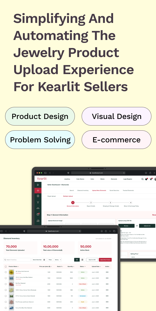
For an online jewelry seller, the typical journey starts with:

Kearlit aimed to provide a dynamic platform for sellers to streamline these daily responsibilities, with the goal of maximizing their sales.
I conducted four user interviews with sellers who used different methods to manage their sales. These interviews helped identify critical problem areas that needed to be addressed
Fewer Uploads
Online uploads are tedious and time-consuming resulting in delays and errors, impacting the efficiency of their uploading process
Inventory Inaccuracy
Keeping track of inventory updates manually resulted in inaccurate stock levels, making it hard to know the actual available stock at any given time
Manual Checking Errors
Reliance on manual checking for mismatch entries during bulk uploads can be time-consuming and prone to errors

How might we create a platform for sellers to effectively upload their products in less time, avoid manual mismatch checks, and maintain stock levels, thereby boosting sales and operational efficiency?

Reduce errors by breaking down of steps
Overwhelming for Users
No Progress Indication

Divided content into collapsible sections for a less overwhelming experience.
Improved focus on individual sections, reducing errors.
Risk of overlooking unexpanded sections, causing incomplete submissions.
Constant opening and closing of sections can be cumbersome.

Tabs provided a clearer division of steps, improving navigation.
Users could focus on one tab at a time, reducing errors.
Tabs lacked inherent progress indicators.
Multiple tabs caused confusion and potential accidental slips.

The progress stepper clearly indicates completed and remaining steps.
Breaking down the process reduces cognitive load and errors.
Guides users through a logical sequence, ensuring all necessary information is entered.
Our user testing results proved that new sellers required
50% less time to upload products, thanks to our intuitive and straightforward stepper interface

Interviewees found the manual process of uploading and reviewing product details tedious and error-prone. Competitive analysis helped me redesign it into four streamlined steps for efficiency.

Sellers begin by uploading their .csv files containing all product details.

To ensure the system reads the data correctly, the seller needs to match their columns with Kearlit's field names. This step is required only for the first upload, and the system remembers these settings for future uploads
This is done via a dropdown menu that shows a match percentage next to each option, helping them make quicker selections
After selecting column names, the system generates a sample value from the .csv file
A "tick" indicates a match; a "cross" shows a mismatch. Unmatched columns are corrected with a replace option

Next, sellers upload product images, with the system checking if the image titles match the corresponding .csv titles
The preview of the uploaded files is visible for the user's reference with options to view or delete the file.

The system flags titles as "Matched" or "Mismatched" and suggests the correct title name
It provides an option to replace incorrect titles or delete any image altogether

A progress stepper, allows sellers to track their upload process, go back and review entries, and save listings as drafts to complete later.
They can also schedule their listing, with a design inspired by Gmail's scheduling feature.
Automating multiple product uploads ensured seamless accuracy, eliminating mismatches by 30%, and creating a smooth seller experience.
"Less Manual More Auto" - Anonymous User

Complex Design Brief
The brief was to design a simple e-commerce site, but its complexity became clear later.
Stakeholder Management
The client insisted on closely mirroring numerous references, making it challenging to align their preferences.
Fluctuating Deadlines
The project timeline was initially set for 2 months but was cut to 4 weeks due to client demands.
"But as they say, 'All's well that ends well,' and this project ultimately delivered great client satisfaction."
I needed a new website for my business and was fortunate to find Shivani Mehta, a professional UI/UX designer. From the start, her expertise and attention to detail were impressive. She not only understood the latest design trends but also took the time to learn my business goals, offering valuable input to enhance the user experience. The result was a stunning, user-friendly website that exceeded my expectations. She skillfully incorporated my branding, was responsive, and made adjustments to ensure my satisfaction. I highly recommend her to anyone seeking professional, high-quality website design.
- Shivam Agrawal, Founder


