37%
Increase in integration completion rate
8 min
Reduction in avg channel setup time
9%
Increase in channel integrations
CONTEXT
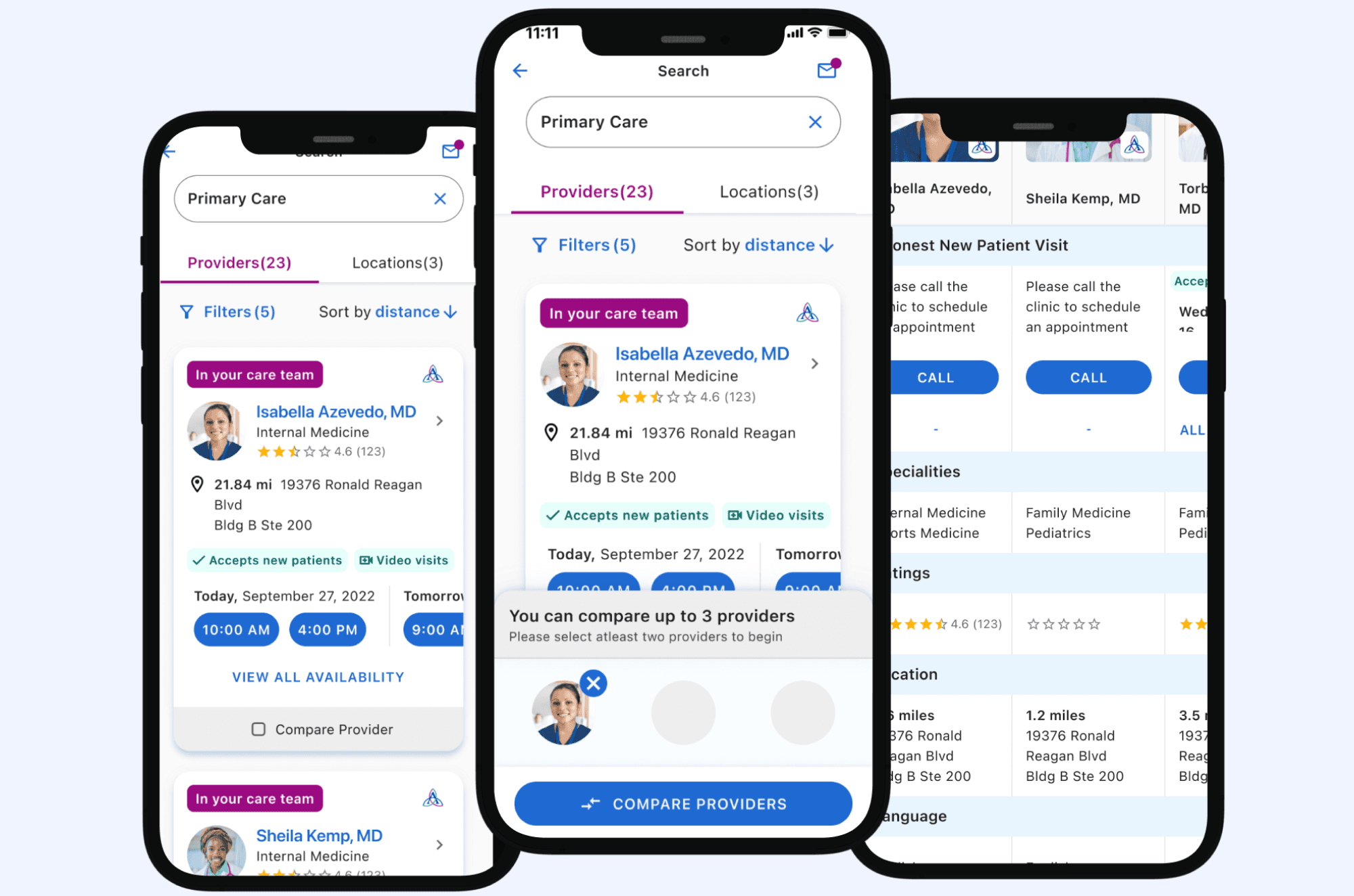
OmniSynkAI is a multi-channel management platform where eCommerce sellers manage inventory, orders, and listings across platforms like eBay, Amazon etc from one dashboard.
DURATION
2 Months
MY ROLE
Lead product designer
MY TEAM
3 Engineers
1 Product Manager
Matthew Malia - Product Manager
EXISTING EXPERIENCE
New sellers landed on a blank page with nothing to guide them
Sellers could technically connect all their channels from one dashboard. The connection flow used a progress bar that tracked steps but explained nothing about what was actually happening. And right after a successful integration, the moment sellers felt most confident — they were handed three dense scrolling forms: Fulfillment Policy, Shipping Policy, Return Policy. No context. No explanation of what the right values were. No indication of what happened if they skipped them.
Sellers who made it through setup had no view of whether their channels were syncing, what was pending, or what needed attention. Support tickets were coming in about setup failures that could have been prevented with better guidance. Completion rates were low. Churn during onboarding was high. The integrations weren't broken, the system around them was.
This resulted in less number of complete integrations, more seller churn and bad user experience
Language barriers
Assistance programs often lack early language selection
Lack of transparency
Parents don't know application status or what happens next
Confusing questions
Eligibility questions lack context about why information is needed
OPPORTUNITY
How might we give parents more authority and feedback regarding their application in their preferred language
GOAL 1
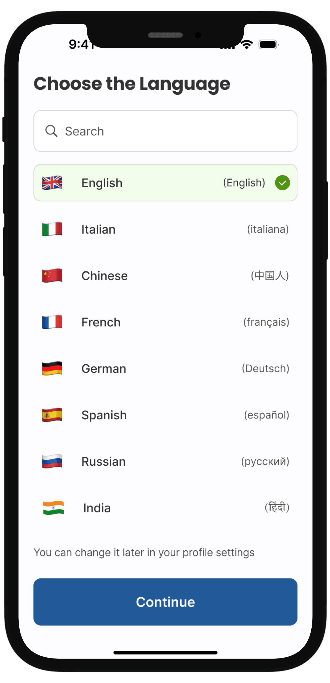
Parents would like the ability to change the language the application is in.
Placed language selection on the first screen parents see, with clear labels in both English and native script.
Removes language as a barrier before parents invest time in the application
Signals inclusivity immediately — "this service is for you"
Allows parents to change language anytime from their profile settings

GOAL 2
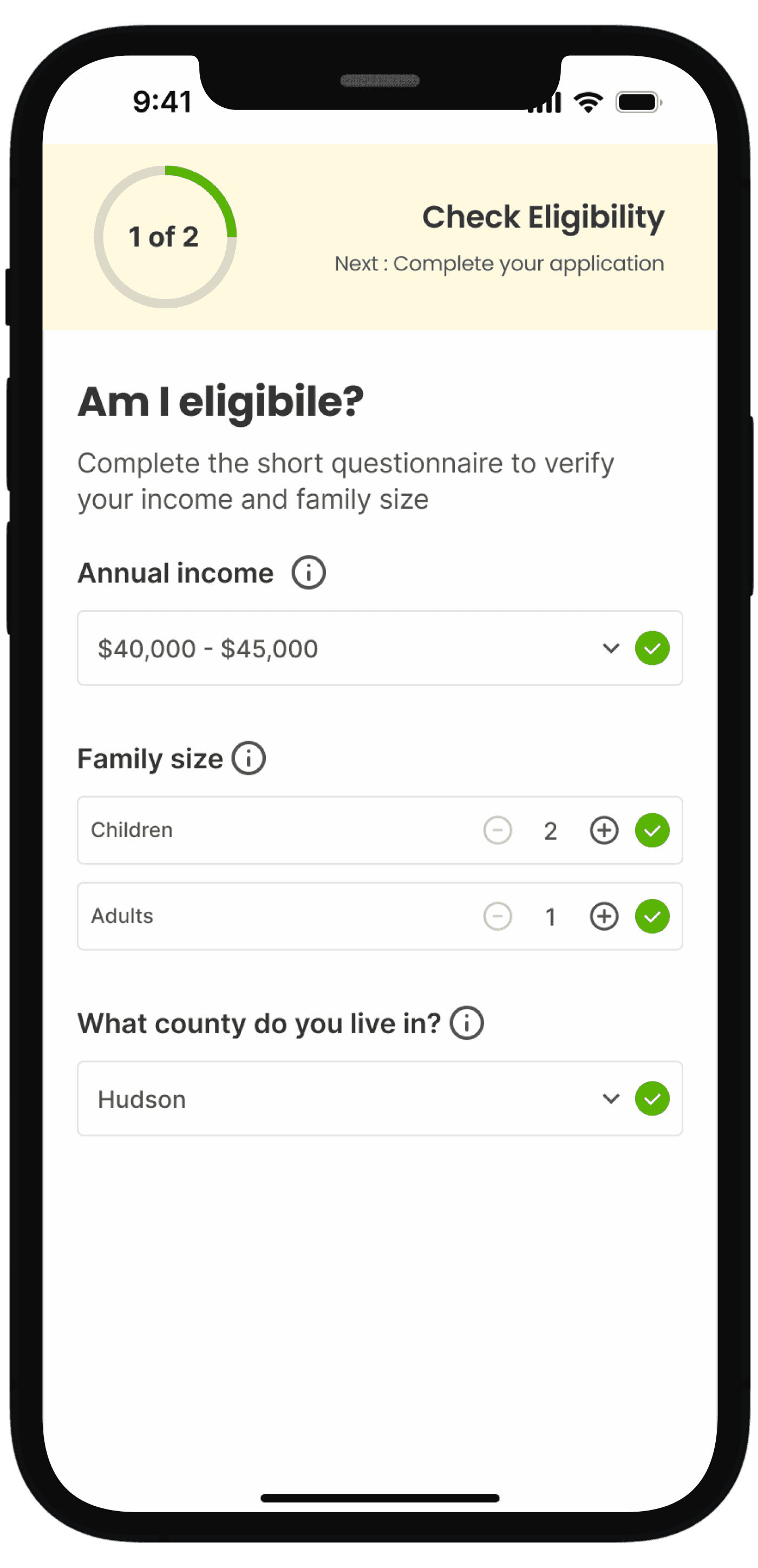
Parents don't understand why they are being asked certain questions throughout the eligibility questionnaire and application.
ITERATION 1
Simple, focused and less overwhelming interface
Tooltip can get missed and also increases one click
Not sure about the qualification criteria being validated
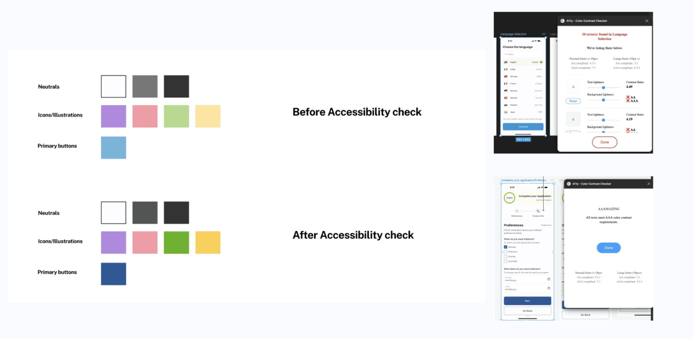
ACCESSIBILITY
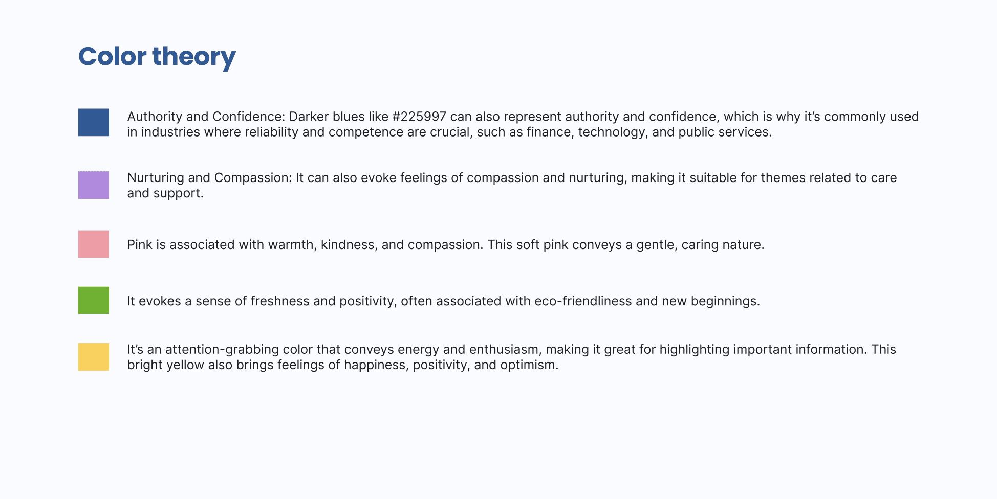
My rationale behind the color choices